Sign Design – A Beginners Guide

Whether you’re planning on designing a sign for the front of your business, the side of your vehicle, or on the scale of a billboard, finding the perfect design for your signage can be a difficult process. Signs are usually the first impression that your business can make on a potential customer, and in a world where we are subjected to thousands of advertisements each day, it’s important to craft a sign that is memorable, concise, and easily visible. If fact, we see so many signs each day that some of them aren’t even consciously registered, meaning that they are not having the impact desired by the business owners.
As one might expect, there is no “one size fits all” approach to choosing and designing the perfect sign. Before beginning the design process, it’s important to decide what the intended goal of the sign ultimately is. Do you want to attract passersby? Do you want to promote a particular product or service? Do you want to inspire intrigue? Having a general goal for the purpose of your sign will give you a better idea of where to begin with its design, placement, and size.
For more permanent signs, especially signs featuring the business name, the purpose is often very obvious: to identify your business and to attract those who are walking/driving by. Unless you’re designing a sign with the purpose of ADA compliance or safety in mind, for the purposes of this article we will assume that the sign you’re designing is for commercial or promotional use.
Before you even begin the sign designing process, you need to determine what is allowed within your municipality. Here at RAM Signs, we have experience working within the confines of local laws all around the Four Corners, particularly in Farmington and Durango. Some municipalities have limits on areas such as size and color scheme. Billboards, in particular, are regulated heavily by local authorities.
One of the most difficult parts of the sign designing process is ultimately deciding what the sign is going to say. If you’re planning on using just your business logo, then the process will probably be much easier, but will still involve deciding on a myriad of other small details. If you’re starting fresh, then you face the challenge of coming up with a concise yet informative message that is appealing to passersby. On average, your sign only has about 3.5 seconds to make an impact on someone walking or driving by, and even less if it’s surrounded by signs from other businesses. For this very reason, your sign needs to be short, sweet, and to the point. In general, it is recommended that signs contain seven words or less, as any more can run the risk of being difficult to read or not read at all. While it’s important to be concise, signs that are too vague can also pose significant problems. If it’s not abundantly clear what your business is and what you provide, then your sign is not serving its intended purpose.
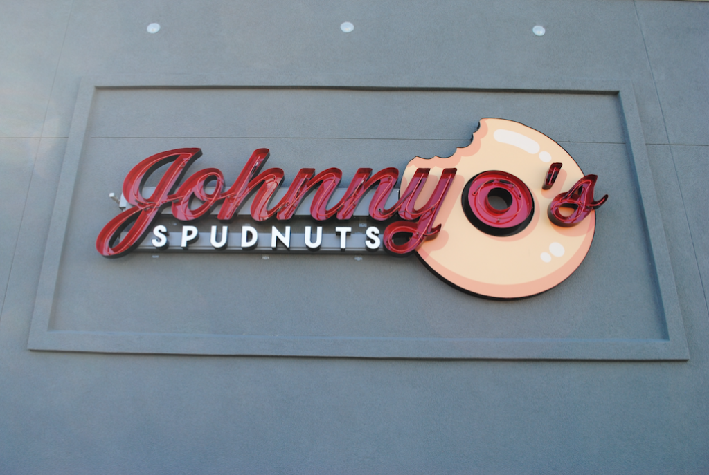
Once you’ve decided on what the sign will say, the next step is to choose a typeface and text spacing. When choosing the correct typeface, it’s important to consider how it will reflect on the image of your business. If you’re incorporating an existing logo, choose either a matching or complementary typeface to supplement the logo’s existing text. Wildly different typefaces could reflect poor judgment or business quality, and may even deter possible clientele. Different fonts go better with certain types of businesses, and it’s important to take a step back and see how you want to present your business to the public. More fun texts are better applied to businesses tending to cater to a younger, more energized audience and are great for businesses like restaurants or day cares. Other fonts can make your business appear more high quality, and focus on more of an upscale client base. Another common mistake that business owners make is choosing text in all caps. While this is certainly applicable to the style of some businesses, text in all caps doesn’t necessarily mean that people will find the text easier to read and will therefore gain more attention. On the contrary, studies have shown that signs with a mix of upper- and lowercase letters are actually easier to read.
Letter spacing, sometimes referred to as kerning, is another important factor to take into consideration. Letters that are spaced out can fill up any dead space very nicely, but can also appear difficult to read if too far spaced out. Different types of kerning can change the overall feel of your sign. Depending on your business style, over kerning, or the overlaying of letters, can also have an aesthetic effect on your signage.
If your logo incorporates and images or photographs, or if you wish to incorporate them anyways, be sure to take that into consideration when choosing your sign’s color scheme. For billboards, in particular, the general rule of thumb is to never choose a blue background, as it has a tendency to blend in with the blue color of the sky, especially in the more open landscapes of New Mexico and Arizona. If your municipality has any zoning ordinances about color scheme, make sure to take these into account as well. Some cities, like Sedona, AZ, are infamous for having strict zoning laws that limit color schemes to only a handful of options.
Color scheme is one of the cornerstones of the identity of your business and helps to reinforce the different marketing efforts of your organization. Choosing a color scheme that is consistent with the other parts of your business operations will help to reinforce your branding efforts, and will help make your business more recognizable in the long run. Certain color schemes are more visible from afar, so it’s imperative that you choose a color scheme that is both highly visible and reflective of your business identity.
Finally, once all of these factors are taken into consideration and accounted for, the final step is arranging the information on your sign. This is where your creative expertise, your business identity, and existing branding efforts will come into play. Don’t over think it! If you think the sign is too busy, chances are your customers will too.
Here at RAM Signs, we have over 26 years of experience designing, building, and repairing signs of all kinds. No matter what step you are on in the process of creating a sign, our team of knowledgeable experts is here to help you from our home base in Farmington, NM. We offer a wide range of channel letter, monument, pole, and digital signs, as well as vehicle wraps and billboards (and much, much more!). We’re here to walk you through the hassle-free crafting of your custom sign from start to finish!
Sources:
https://designshack.net/articles/graphics/6-tips-for-designing-signs-and-billboards/
https://www.entrepreneur.com/article/233961
https://www.esigns.com/effective_sign_design_tips.html
http://www.redcrowmarketing.com/2015/09/10/many-ads-see-one-day/
